KTDC (KLONGTOEY DENTAL CLINIC)
Facade Design Approach A clinic facade design built for simplicity, strength, and cleanliness; striking in appearance, functional in use.
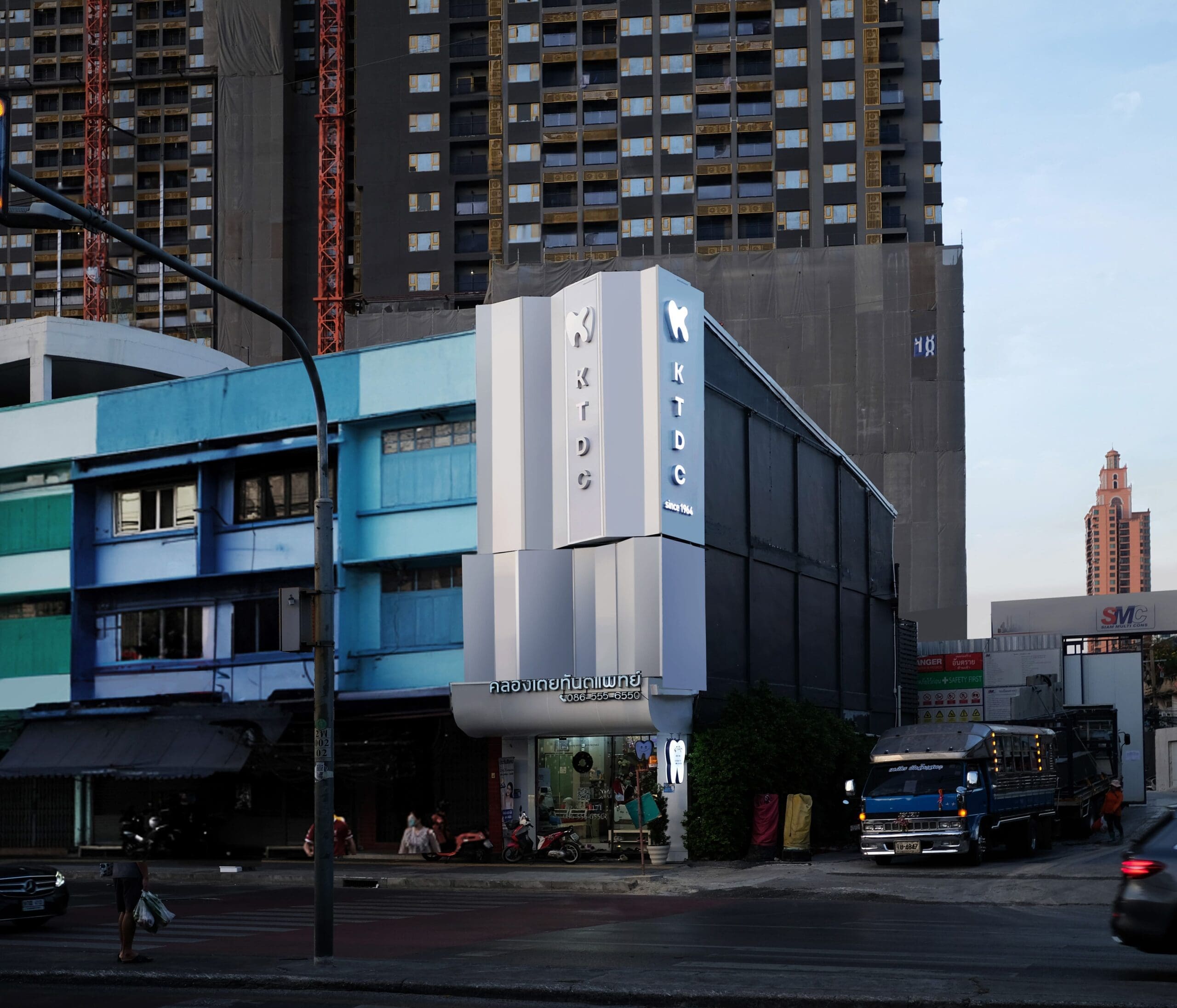
The facade design of KTDC emphasizes simplicity, strength, and cleanliness, creating a visually striking yet functional clinic facade. Strategic lighting and linear patterns add depth and character while maintaining a refined, modern aesthetic that seamlessly blends contemporary design with a professional, sophisticated corporate identity.
Design Concept
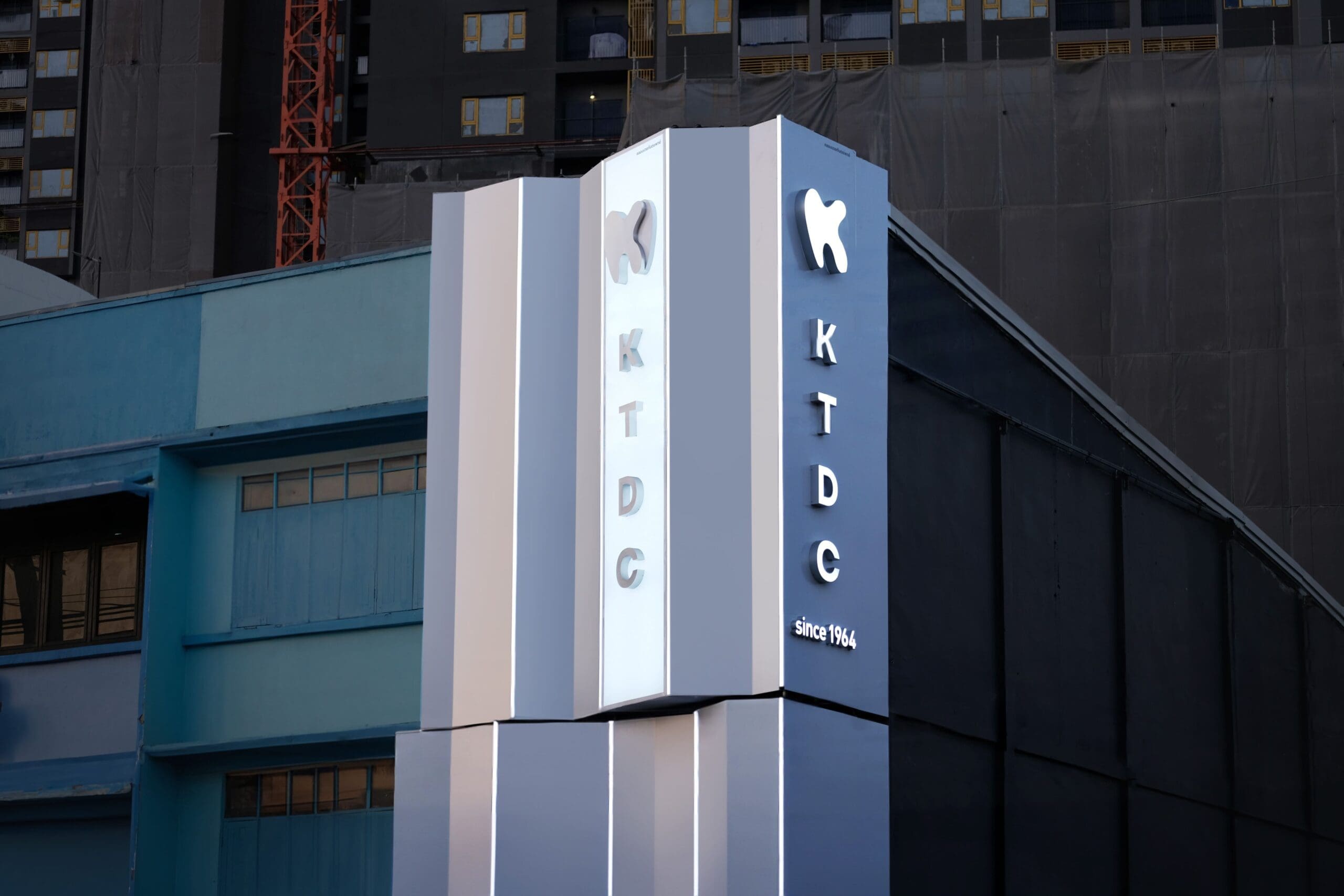
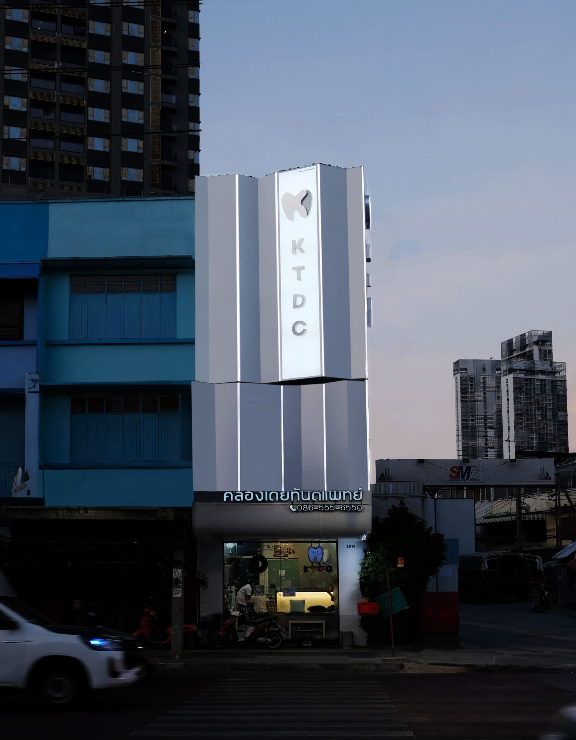
The facade design uses a sleek, contemporary approach; minimalist color tones, LED accent lighting, and a 3D logo combine to enhance the building’s visual appeal both day and night. This design approach reinforces KTDC’s professional branding while enhancing the overall user experience, giving the clinic a sleek, modern identity that stands out.
Materials & Color Palette
A white and gray color scheme was selected for this facade design to reflect a professional, polished brand image.
Lighting & Branding Elements
Strategically placed LED strips add depth and dimension, making the facade more dynamic, while the KTDC logo is installed as a 3D backlit element, creating a striking illuminated effect at night that enhances the building’s visibility and elegance. Clean, vertical lettering complements the facade’s vertical design language, ensuring a cohesive, unified appearance across the whole clinic facade design.
Urban Context
The facade is designed to harmonize with its surrounding urban context while maintaining a distinctive identity. Although neighboring buildings feature a variety of colors and architectural styles, this clinic facade design adopts a minimalist yet striking approach to establish a strong brand identity through architecture – allowing KTDC to stand out with sophistication while still blending into its environment, reinforcing its professional image as a recognizable landmark in the area.